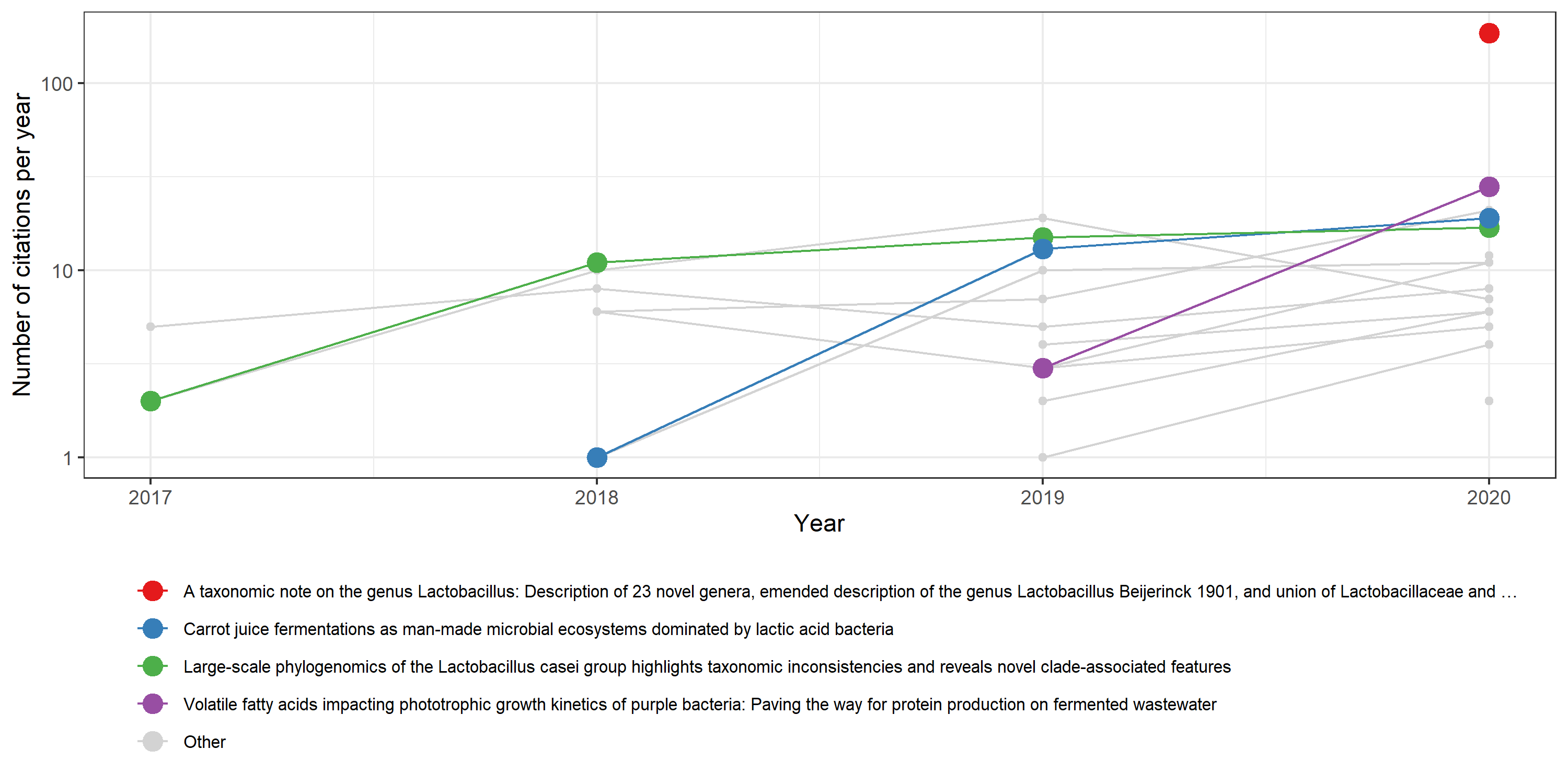
Next week I will submit a new research grant. One document that I needed to update for this submission was my scientific CV. I believe that such a CV needs to have a list of your scientific publications, or a selected relevant subset. I decided that I wanted to spice up the CV a little bit and wanted to plot the number of citations those papers had compared to my other publications. I therefore came up with this little R script that I am happy to share with you all!
library(scholar)
library(tidyverse)

# You can get your scholar profile id from the URL
# https://scholar.google.com/citations?user=HbZh3aAAAAAJ
id <- "HbZh3aAAAAAJ"

# Fetch a dataframe with your publications
publications <- get_publications("HbZh3aAAAAAJ")

# Get the citation history of all publications
citation_history <- publications %>%
  select(title, pubid) %>%
  #
  mutate(cite_history = map(pubid,
                            # Get the citation history for each publication with purrr magic
                            ~ get_article_cite_history(id, .x) %>% select(-pubid)
                            )
         ) %>%
  select(-pubid) %>%
  unnest(cite_history)

citation_history_plot <- citation_history %>%
  # Filter the current year
  filter(year < 2021) %>%
  # In this step I select the titles of 4 manuscripts that I want to stress and rename all others to "Other"
  mutate(title2 = fct_other(title,
                     keep = publications$title[c(1,2,5,6)], other_level = "Other")
  ) %>%
  # Start plotting
  ggplot(aes(x = year, y = cites, colour = title2, group = title)) +
  # This dummy points plot is added to make sure the order of the legend is not changed
  geom_point(alpha = 0) +
  # First add the points and lines of papers that are not highlighted
  geom_line(data = function(x) subset(x, title2 == "Other"), colour = "lightgrey") +
  geom_point(data = function(x) subset(x, title2 == "Other")) +
  # Now plot the highlighted papers so that they are above the non-highlighted
  geom_line(data = function(x) subset(x, title2 != "Other")) +
  geom_point(data = function(x) subset(x, title2 != "Other"), size = 4) +
  # Some more tweaking
  scale_y_log10() +
  xlab("Year") +
  ylab("Number of citations per year") +
  theme_bw() +
  theme(legend.position = "bottom",
        legend.text = element_text(size = 8)) +
  scale_colour_manual(values = c('#e41a1c','#377eb8','#4daf4a','#984ea3', "lightgrey")) +
  guides(colour = guide_legend(ncol = 1, title = element_blank()))

ggsave("citation.png", citation_history_plot, width = 10, height = 5)
This resulted in the following graph:
It could use some extra visual tuning, but I love the result!